 Bubble Gum Sculpture of Man Falling


Last but not least chocolate skull looks ancient
Bubble Gum Sculpture of Man Falling


The sculpture I found was an installment within a fountain in the Park Blocks next to Cramer Hall of Portland State University. Farewell To Orpheus, by Frederic Littman in 1968, is a cast bronze sculpture depicting a reclining woman, her hand outstretched towards something in the distance. She’s lying back, or floating, through what looks to be branches. But given that the sculpture is meant to be surrounded by water, one can assume that she may be floating through seaweed. Currently, there is no water surrounding the statue. The sculpture has a definite sense of movement, almost as if the depicted woman is floating away from where she looks with her hand outstretched. The texture of the cast bronze adds to the effect of making one believe that perhaps this sculpture is meant to be viewed as underwater. Rather that having smooth and definite lines and form, the bronze has an uneven surface that almost looks like smoothed over boiling liquid.
-Enrico Macias-Zepeda


The artist Brent Ozaeta has his installation Introverted Floating World available for viewing at the Cambers @ 916 gallery through February 26th, 2011. These are silkscreened prints on wood panels measuring 62.5” by 42” and silkscreened paper measuring 11x14.
At first glance, the prints could easily be dismissed for their largely abstract patterns, difficult to recognize content and lack of color variation. But it is exactly when these elements have been parsed and understood to be present that the works take on a complexity worthy of examination.
Not being of Asian influence it is difficult for me to identify cultural references. One figure is in the style of anime. Others are more representational of the human form. Some can be disturbing. In one print girls appear to be performing surgery on a man’s face. Another figure appears with head in hands while framed by line and patterns. The choice of pink, a sometimes gentle, loving color, is a strong juxtaposition. Even the three smaller prints also available for viewing do not escape a conflicting depiction. The central image, like the others, is dominated by intricate flowers and abstract patterns. What appears to be the joyous movement of children through this landscape is accompanied by checkered patterns completely eliminating facial features.
Many of the abstract patterns of the the three large panels have a repeating pixelated design. A nod to our digital age. These are largely geometrically fractured and layered as if collaged together to build a uniform piece. Pink is woven, imposed on and hidden under a sea of black. In the smaller prints black has been replaced by a dark red and more naturalistic patterns and representations.
Ozaeta’s work possess mystery, by the artist’s own admission and intent. This quality is well executed and holds the viewer’s attention. One can place themselves into the mood or an interpretation of the visuals. The patterns and mystery combine to create a jumping off point before descending into a Rorschach test.
Jeremy Wenrich


Michael Welsh, Where Are You Taking Me? 2010, Mixed medium sculpture (wood, found objects, foam, sugar) 40 x 18 x 15 inches.
https://blogger.googleusercontent.com/img/b/R29vZ2xl/AVvXsEhYFAt-OsdWzT7wYlD5vzxSHUUJsdX_OXIKL9b1pBjHO527A5QgA4P5K1cV6KGjZNYitc4ZsuTgDx-Fmu2fB1_X5JYg6kc00zEPSZtoa0dS1RcIZibK8kIgy9TLmd4Tr5wIhl5toPB4rtc/s1600/Mwelsh1.jpg
https://blogger.googleusercontent.com/img/b/R29vZ2xl/AVvXsEgat1E8iNr-Ihyphenhyphen2VKOFdcdMXja6SqFa6QQZoOKhhT-SLvuxNo5Mqk3EeRJGnEURThkYrAWx2_pOVIa7PkGUEbiRjLEb1GoE8u_G_Lz6seZjIUuNDG0JBlkHN3w_WBafglzT0TDIfs_n1NA/s1600/Mwelsh1detail.jpg

 Michael Welsh is an MFA Visual Studies candidate at Pacific Northwest College of Art, his art can usually be spotted in the back of the Feldman Gallery. It is easily recognizable, typically it includes bright colors, a mixture of found objects and words between heavily layered paint. It is clearly inspired by the Dada movement, Jean-Michelle Basquiat and the push for “conceptuality” in contemporary art. It is not clear whether in his work he is attempting to mimic the forefathers or debase their credibility. Either way, Michael Welsh current exhibition includes work that includes readymade sculptures, as well as paintings.
 I found Where Are You Taking Me? to be particularly interesting. This is a mixed media sculpture, assembled from wood, found objects, foam and sugar. The first identifiable object in this piece happened to be a gray hooded sweatshirt, with a t-shirt that hints at being an Iron Maiden concert souvenir. This sculpture contains the surprising element of having melted foam dripped on top of the wooden torso, the white of the foam is shaped in the form of the missing head of the figure. His work is humorous, it is sprinkled with sugar on top. The main objective of the artist aims at being conceptual-based. The title of the sculpture, as well as the form, suggest a profound story, which is not revealed clearly. Overall, Walsh’s assemblage exhibits the attempt to question art, with his usage of unusual methods.
Yevgenia Tsveleva


For this first Thursday assignment I didn’t make it to any galleries, but I walk past this strange sculpture from Wallace Park quite a bit and figured that it would do. This three dimensional piece was created by Manuel Izquierdo in 1980 and it is titled Silver Dawn. It’s measurements are about nine feet wide, and including the base about six feet tall. It is made from a silver metal, although I am not exactly sure what. To me it appears to be a giant seal or walrus, but because of the name, only having one eye, and only three possible legs it makes me unsure as to what it really is. The negative and positive spaces are really interesting, the large rather geometric forms seem to draw the most attention, for me anyways.
Izquierdo was born in Madrid, Spain in 1925 and came to America in 1942. He received his BFA at the Museum Art School in Portland, Oregon and went on to stay to study more and work in Portland. He was mainly a sculpture but also was well known for working in woodcutting and was later an emeritus professor at PNCA. He has done many other public art pieces in Portland including The Dreamer which I believe someone else did their previous first Thursday assignment on. Manuel Izquierdo passed away in July of 2009.
-Amy Grider


The bicycle sculpture across the street from the Burnside and 10th is something that I pass all the time. Every time I look at it and think how interesting it is. It makes sense that someone would make a sculpture out of bikes here in this city. The sculpture is called the Zoobomb Pyle and was created by Brian Borello, Vanessa Renwick and the Zoobombers.
The bike sculpture is composed of several children's bicycles of varying colors and sizes. There is a large group of bikes clumped together at the bottom and mounted on a concrete base. At the top of the pole there is one golden bike. It reminded me of a Christmas tree. In the bottom clump, the wheels and handlebars are all sticking out at different angles. The clump at the bottom creates a feeling of weight and mass, but there is also plenty of negative space. The sculpture could be viewed as allegorical, it tells the story of the great kiddie bike king of the hill.
To me, it is a colorful, joyous, and an interesting composition. It looks as though a bunch of kids decided to make a pyramid with their bicycles. Every time I pass it I feel as if I want to ride my bike down the hill and park it next to the rest as an offering.
Richard


I really enjoyed my visit to First Thursday. There seemed to be a lot more going on at this one compared to the previous First Thursday. For instance the Portland Auto Show was in town this weekend and as a result, there was a small auto show in the middle of the main strip in the
Jordan

Every summer I always hang out at George Rogers Park in Lake Oswego. As you walk down to the waterfront you see this very large, dynamic sculpture by Matt Cartwright named “Trillium.” It is made out of powder coated steal pipe and flat bar powder coated aluminum. The sculpture has two functions, an art piece and a place to sit. It is a large scale flower with strong lines. A sense of rhythm is created through shape, the same shape of the petal is seen throughout in the leaves and the petals. The sculpture shows a good representation of positive and negative space that is created by the thick lines adjacent to the contour of the petal that separates the shape. There is a sense of heaviness on the top and bottom of the sculpture where the petals and leaves are located, but the proximity between them is not very close. The center of the flower is a bright red in contrast to the white of the flower petals, making it the focal point. The leaves and petals both radiate from the stem with symmetrical balance. The petals are all symmetrical in shape and size, but the leaves have a progressive movement of small to large around the stem, but keeping the same shape. I think the use of the sculpture is very creative, since it is in a park it was smart to have it be interactive by being able to use it as a bench.


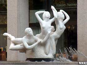
In downtown Portland there is a white sculpture in large proportions, located by the Standard Insurance Building (formerly the Georgia-Pacific Building; and is located on 900 S.W. Fifth Avenue). It is titled “The Quest” and was created by Count Alexander von Svoboda in the year 1970. “The Quest" (also known as the "Three Groins in a Fountain" by locals) consists of a group of five nude figures, the dimensions of each being five times larger than life. This is a masterpiece carved from a single, 200 ton, block of white Pen telic Greek marble. The inspiration behind the work is Michelangelo. It was quoted from the artist: "It depicts the growth of today and tomorrow and the awakening to the future. I wanted to have complete contrast between this piece of sculpture and the Georgia-Pacific Building. The sculpture is designed to lead the beholder to look towards the middle of the building and then up."( quoted from http://www.roadsideamerica.com/tip/13852)
The reason I chose to research this sculpture, was because I have always be fascinated with it since childhood. I also wondered what the message behind it was.
Orphan Drug: New work from Dunja Jankovic and Derek Bourcier, MK Gallery, PSU campus, Feb 2011
-Matt Hall
Dunja Jankovic’s installation is the first thing you notice when entering “Orphan Drug,” the new show at PSU’s MK Gallery. One wall is covered with a large painting comprising large geometric shapes in red, black and white, with no shading or blending of colors. The remnants of an early painted-over version are clearly visible. I believe this was a deliberate decision to let us, as viewers, experience the process, and maybe a statement of the artist’s intent, as in “this art is not precious.”
In front of the painted wall, about 20 or so balloons hang from the ceiling or float from the floor on fishing line. This use of a common, mundane surface reinforces the impermanent, nonfussy aesthetic of the show. I talked with the artist about the process. She carefully unties and refills the balloons as they start to go flat. She also mentioned having to try three kinds of paint before finding one that wouldn’t flake off as the balloons expanded. All are painted in the same red, black and white color scheme of the wall. Most have similar bold geometric designs, somewhat reminiscent of the Native American art of the Northwest Coast, while others have thin, squiggly marks, almost like a Miró painting. Jankovic has developed her own pleasing visual vocabulary, with repeated motifs but also a restless experimentation. I enjoyed watching visitors bob their heads around and through the spaces between balloons.
A short musical performance accompanies the show, consisting of what seemed like tape loops and samples run through cheap guitar effect pedals. Although I found the performance interesting, I’m not sure how it is supposed to relate to the visual works.
Derek Bourcier’s work occupies the space behind the mural wall. Three ink-jet prints of a lost dog poster hang in frames. Connected to the pictures is a thin tube that slowly pumps water into the frames. Over time the ink runs and distorts the images. Three red towels collect the water as it drips through the frames and onto the floor. Bourcier told me he is influenced by the way posters decay in the Portland rain. His work just barely qualifies as 3-D, but I thought I would write about it here because he has found a way to introduce time and chance as elements in visual art.
Jankovic and Bourcier share a similar lack of concern for permanence and the more fussy aspects of craftsmanship. They both seem to have developed a compelling visual vocabulary. Jankovic through the particular personality of her mark-making and Bourcier through surrendering to chance.


