 I drove past this everyday and I still don't know if I like it or not. I did some Googling and found this to be a very mysterious 12 piece sculpture. It is called "Cattle Drive" by Michael Booth. I didn't get to jump out of the car and touch it to see what it was made out of, but my guess is that it is painted metal. It was pretty cool how textured everything was, I think it was overly textured so when you are driving you could see all the little details.
Sunday, March 6, 2011
It Suits Pendleton Pretty Well....
I drove past this everyday and I still don't know if I like it or not. I did some Googling and found this to be a very mysterious 12 piece sculpture. It is called "Cattle Drive" by Michael Booth. I didn't get to jump out of the car and touch it to see what it was made out of, but my guess is that it is painted metal. It was pretty cool how textured everything was, I think it was overly textured so when you are driving you could see all the little details.
Final First Thursday:
 Geraldine Ondrizek
"Sound of Cells Dividing" (2008-2009)
Hand Made Paper, Film
 The work is a free standing screen (soft sculpture?), approx. 10' tall, assembled in a half circle shape. Impressively, the artist made all the paper by hand. As you approach the screen, a ringing is emitted from speakers, that are embedded in the layers of paper. On the other side of the screen, a projected video plays in a continuous 12 minute loop. The content of the video is excerpts from over 200 hours of recorded footage from a stereo-microscope, of human cells dividing. The really cool part is that the sound actually is the recorded sound of the cellular activity. The tape switches over after 6 minutes, from footage of healthy cells to cancer cells, and the audio recording switches as well. The nearly melodic ringing becomes an agitated clicking sound, abruptly altering the viewers impression of the footage.
I chose this piece because I thought the use of multimedia was orchestrated to an interesting allegorical effect. The double layer paper screen, with it's fleshy texture, gives the sense of a multi-layered cell wall. Within it lies all the workings of the cell itself. The screen isolates the viewer with the video and sound. Confronted with the footage, the effect is at once intimate, alien, and entirely sublime. The sublime quality is also reinforced by the massive scale of the work. The composition has a conceptual unity, that is derived from the use of a variety of materials. It integrates negative space into an interactive work that forces the viewer to explore it's dimensions.
The Dallas Overpass
 Since I've been out in Pendleton all week I thought it would be appropriate to do public art pieces I saw on my adventure. My phone/camera died, so I had to try to find the pieces that stuck out in my mind and could find on the google machine. The top picture is an overpass in The Dalles. I couldn't find out Who the artist was, but I did find out that the fish were aluminum and the waves were painted steel (thank goodness). It was pretty cool that just about every overpass on the drive home either had metal salmon or horses on them, with the exception of the train overpasses, which were just reinforced concrete.
tripper dungan

Tripper Dungan is a local Portland artist who creates silly, psychadelic, often 3-dimensional paintings and artwork. He works mainly with found materials, or other people's junk, and creates imagery that calls upon the endlessness of perception and the amazing places that we can go with our imagination. Even his two dimensional work has the illusion of three-dimensionality, mainly through use of texture and color.
This piano diorama, which was on display at the Pony Club gallery, combines dissimilar materials to create a striking and playful composition. Dioramas are a nostalgic form of art that often recall childhood school projects or church nativity scenes. The child size play keyboard on the front of the diorama even more strongly brings associations of youth. The subdued, more monochromatic colors used for the worn wood back of the diorama juxtaposed with the bright (but still pastel) colors and shiny, man-made finish of the keyboard are dissimilar enough to add visual interest but not so dissonent as to throw off the viewer from the overall mood of the piece.
The piece still manages to have visual unity despite the variety of materials used by having the encompassing texture of the diorama be uniform. The intentionally imperfect paint job throughout the external box which holds the inner scene of the diorama. The rustic bark corner accents and the hand cut lighter wood teardrop shapes also playfully reference the type of finishing touches we might see an on old church organ or austere grand piano. The fact that there are no hard edges or corners, and that all of the lines we see are curvilinear adds a very informal, friendly softness to the piece.
Then, we are brought to the inside of the diorama. As oppose to the primarily pastel blue paint we see covering the outside, the inside has much more of the darker wood finish showing through, giving the inside more visual depth and drawing attention to the centerpiece of the scene; a small masculine character with a body shape reminiscent of a Lego toy. This figurine, however, has an intentionally more organic appearance created by the partitions of his joints being more rounded than a typically mass produced Lego and of a lack of sheen or polish.
This man character has a rainbow of colors covering his form, which really makes him pop against the muted blue of the outside of the panorama and the dark wood of the inside, and the variety of colors and the palette itself recalls a more subdued version of psychedelic 70's art. There is a small talk bubble, made of wood, which extends from his mouth, clearly referencing the imagery we would see inside a comic book, usually a two dimensional medium. It adds even more visual interest that both the talk bubble's sides are black and the music note's front are black while the side of the music note is blue. This unconventional color choice gives these items dimension in an unexpected way. Overall, this piece works well compositionally and is an interesting and original take on the traditional diorama. You can see more of Tripper Dungan's work up right now at the Goodfoot this month, over on SE 28th and Stark.
-ADI DOV
"Shine" by Mylan Rakich


Mylan Rakich’s sculpture titled “Shine” stands in the courtyard of PCC’s Cascade campus. The steel sculpture is composed of many intersecting and interlocking linear pieces often forming a multitude of various geometric shapes. These shapes are contrasted by open cylinder shapes. The linear pieces for the most part are oriented vertically creating a sense of movement for the viewer as the eye tends to work its way up the the sculpture and then back down again.
However, these cylinders seem to interrupt this movement for a moment forcing the viewer to pause along the vertical trail when reaching one to observe what is being framed by the circle. It then allows the eye to continue on it’s vertical path until it reaches the next cylinder for again another pause. The cylinder’s framing capabilities come from the use of negative space. Negative space is distributed though out the piece as well, in the open areas of the created geometrical shapes. This construction forms a felling of mass webbing or netting.
The shape of the object seems to taper or narrow towards the bottom as it becomes connected to its linear and circular base. With this shape a sense of escape or explosion is formed. The piece is titled “Shine” which may have influenced my observations, but I do get a sense that a beam of light is being emitted from the ground. I also thought it’s title might be a reference to what kind of interesting shadows might be created by the variety of shapes and depending on where the sun is shining from. However, there is not much cement at the base with mostly grass surrounding the object without much to contrast with shadows. If that was the intention, the feeling would most likely be lost due to this placement.
-Veva Campeau
Marie Watt
 This piece in the Portland Art Museum was done by Marie Watt titled Almanac: Glacier Park, Granny Beebe and Satin Leger. It is made out of bronze, wool blankets and salvaged cedar. Aside from being a piece that I especially liked, this sculpture had a lot of symbolic meaning that I think made it even more interesting. Marie Watt takes an ordinary and familiar object and completely changes the textural and physical elements of it. I particularly enjoyed the juxtaposition of the hardness of the bronze blankets to the softness of the wool blankets. The piece almost fools the eye; when I first saw it, I thought it was entirely made out of blankets until I realized that the majority of them were bronze. I am uncertain about how this piece was made although if I had to guess I'd say it was bronze casted.
 The rhythm of the repeated textures of the bronze blankets is broken up by the placement of the real blankets. I find this aspect of the piece to be the most striking feature and almost humorous in a way. As your eye moves from the base of the sculpture upward, its surprising to see the real blankets being tucked in there amongst the look-alikes. In addition, the real blankets may even add to the realistic qualities of the bronze blankets. My interpretation is this: The real blankets seem to suggest a whole new level of reality that almost identifies with the viewer, creating this immediate connection whereas the bronze blankets appear to be fixed in time; almost frozen, as a fossil-like representation of the former life of the blanket.
In this piece I can identify continuity of line, shape, texture and form. There also exists the strong contrast between the bronze blankets and the real ones, creating a subtle yet powerful variation in the otherwise unified piece.
Olivia Serrill
First Thursday: Tigard Transit Center Max Station


Unfortunately because of several large projects being due next week, I didn't make it to First Thursday and decided to choose an art project a little easier for me to access.
This particular piece called the "Tigard Interactivator" became my focus due to the playful nature as well as this being part of a set. The first time I've ever seen this table of bronze heads was driving past the Tualatin MAX station on Boonesferry Rd. near Haggen. I did not expect it to be such a wide spread set with Interactivators not only in Tualatin and Tigard, but also in Beaverton, Wilsonville, and at the Hall/Nimbus Station.
For the Tigard Interactivator, the faces are bronze cast with I'm guessing a sort of resin or enamel over them. Some are extremely colorful while others much more plain, choosing only a patina and buffed bronze for definition. Each face has a name like "The Vegetable Head", a potato looking face, "The Blind Head", a head with a scarf tied around the eyes with a mirror attached to the back of the head, and, my personal favorite, "The Mirror of Illusion", an oval, chrome plate almost an inch thick with a small head on one side of the mirror and the small head of a terrapin on the other.
All the heads and a large train engine are set on a steel table that has twisting paths so someone who is waiting for the MAX can entertain themselves by scooting the objects from one side of the table to the other. Given that the paths look limiting at first, they are set up in such a way that a head can move into a "dead end" on the path to let another head be moved past.
The intention of this work was made very clear with an engraving. In one inch tall letters, the artist has written this message:
"This sculpture, a theater of sorts, explores human interactions fround in places where people come together, such as a train line. The cast of characters express various traits, gestures, states of mind, emotions, feelings and fantasies. You decide who goes where and what path they take. By activation you will create new scenarios between the characters. Use your imagination, trust your instincts, and have fun."
My initial reaction to this work while walking past it was the assumption that it was some sort of recreation of buildings or architecture, maybe an interpretation of the map of the transit lines. I had seen children moving the pieces around a couple of times, but it wasn't anything too interesting. A closer look makes me think that this is really a great idea. The faces are all very different with big personalities. For something made of bronze, typically drab in coloration for public art, this is a very lively piece and much preferred to standard commissioned public art in which the artist is often restrained from utilizing their full creativity.
I love that this is one part of a rather large set along the Max WES line. Even though the line is obviously connected by track, having this reoccuring art really makes the line feel unified and offers the same interest when a child goes from one playground to another, all the essentials are there, but the different placement make it interesting, new, and fun. I also like that children are considered in this. Many, many times I have seen children running around restlessly, being harped on by their parents to hold still or the children squatting off in a corner trying to entertain themselves. These Interactivators give them something to think about, something to play with, and while they can't pick up the heads, the ability to scoot them along the tracks with very minimal effort makes them very accessible. This is not to ignore the older transit rider who just needs something to do while waiting.
All in all, while at first kind of funky looking, The Interactivator series was a great investment for the cities involved on the WES line and for Trimet as a whole.
If you want to see more, here's a pdf on the project: http://trimet.org/pdfs/store/Interactivators.pdf and the Trimet Website's page on them: http://trimet.org/publicart/wespublicart.htm
Table for One

Last summer as I was hiking through Hoyt Arboretum I stumbled across a miniature chair and table that was located a few feet off one of the main hiking trails. Towering at four inches the miniature furniture was tucked into a divot at the base of a tree. No information about the artwork or artist was posted, but the intention of the composition suggests a familiarity to how we use furniture. The two freestanding objects were construction using wood, fabric, and glue. The top of the miniature table has melted candle wax indicating that it once held a burning candle. This could suggest it was built as some type of shrine or celebratory piece, but I think it was placed on the side of the trail for amusement to onlooking hikers. The most appealing contributer to the artwork is the negative space of the concave shaped tree trunk. The intentional placing of the miniature furniture in relation to the tree gives an aesthetically beautiful shape that frames the furniture as if it was located inside a tree house.
- Harley Wilkins
First Thursday
3-D Center of Art and Photography
I found this gallery to be totally fascinating. I am a huge fan of this gallery. The use of lighing and color and technique for photography turning it into 3-D art is unique. I plan on coming back to this center for the classes and workshops they offer to teach me these techniques. I found this avenue more of what I would like my photography to look like.
Out of all the photographers shown I think that Mark Ruff, is my favorite. He has won many awards for his 3-D photography. If I had to choose an artist to emulate I would have to pick Mark. The way he use light, color, texture and compter graphics cause his art to almost come to life.
I was not allowed to take any photographs while I was there but I did find his web site http://www.timesplice.com.au/3d-portraits.html.
Christina Van Holland
Urban Hydrology


Every day I go back and forth from my classes, I notice these public art pieces that are placed along the street between Mill and Hall Street. These instillations, Urban Hydrology by Fernanda D'Agostino done in 2006, are carved granite sculptures that represent the environmental science that takes place at PSU. The enlarged microorganisms give a sense of being organic through the way some of them fold and look as if they may be floating. The divots in each of them also contribute towards the sense of realism and their sense of 3 dimensionality. None of these heavy sculptures require any armature as they are all resting on the ground. The placement and spacing between each piece is perfect to keep the viewer interested and allows one to follow them down the block. These pieces are similar to our replicas project in the abstraction from the original size. What gives these sculptures such an appeal is the accurate representation of their original forms, and the public placement of them. They capture the attention of the viewer because these are not shapes and forms that one would normally see.
-Rico Macias-Zepeda
"Burning African Village Play Set..."


The Portland Art Museum always has a rotating showcase that changes every couple of months. From January 8th to April 17th they are holding an exhibit called “Safety in Numbers? Images of African American Identity and Community.” In observing this exhibit I came across a piece that stood out from all the rest. The piece was Kara Walker’s “Burning African Village Play Set with Big House and Lynching” done in 2006. Created from laser cut steel. This is a perfect example of positive and negative space, the silhouettes of each individual piece contain openings that create different shapes through the negative space as well as the positive shapes. Not only do the individual figures create shapes, but the placement and proximity of the pieces do as well. Depending on where you stand around the art piece the contours creates a variety of different shapes through the positive and negative space. The simplicity of the all black figures creates unity in each piece and draws the attention to all of the small details. The white stand that the art is placed on enhances the contrast of light and dark. This art piece is a beautiful depiction of the dissimilar society of whites and African Americans.
“Quantum Man”

Julian Voss-Andreae, "Quantum Man"
Julian Voss-Andreae prominently works with the welding process, creating large-scale, public installation sculptures. Currently, some of his work is displayed at the Presentspace Gallery in the Pearl District. The show stands as a teaser for his larger works, meant to be seen within nature and the city, rather than a white-walled enclosed space. Through his work, Julian Voss-Andreae attempts to captures the human and artistic connection to science.
Different from his abstracted, geometric work, portraying cells and chemical structures, this show includes figural works. The “Quantum Man” is composed of thin and flat, biomorphic plates, placed vertically to create an overall abstracted male figure. Essentially, this figure is free-standing, built from powder-coated steel, shaped to be 50” high, 22” wide and 9” deep. From the side, the figure becomes a composure of lines, implying the mass of a running man. The shape stands unified with thin metal pins, set in between the plates. Julian Voss-Andreae uses the Gestalt approach to sculpture, which is influenced by his background in science. In what he calls his “quantum sculptures”, Voss-Andreae uses an interdisceplinary approach to sculpture, by exposing the internal structure of the figure. The implied motion, set through emphasis on the negative space of the figure, Voss-Andreae puts a question on the metaphorical weight of a human being.
More work and info: http://www.julianvossandreae.com/
Saturday, March 5, 2011
GINGKO BERRY, Ming Fay
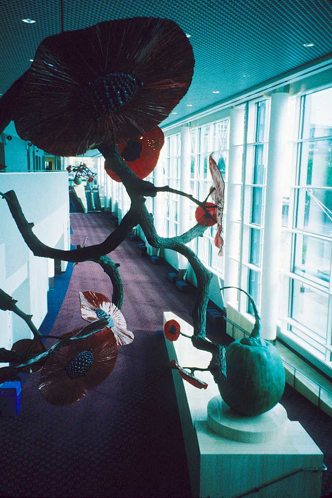
Ming Fay’s, sci-fi inspired botanical form caught my eye at the Oregon Convention Center. This public art sculpture appears to have outgrown its tiny pedestal, and extends over the walkway. The gigantic glass flowers hover above the floor, held up by a bronze branch armature with a round, green gingko berry making up the base.
What makes this sculpture successful is not only the dynamic form, but well-picked color palette. The bright red, dominating flowers complement the green hue of the branches and gingko berry. Without color, the sculpture would not take on such a mysterious feel. Another successful element of this piece is the scale. With Fay’s Ginkgo Berry, we are placed in an “Alice in Wonderland” sort of world in which we are forced to compare Fay’s sculpture to the reality we live in.
Ming Fay uses his knowledge of gardening to create his own, hybrid plant species. Inspired by nature, specifically the plant world, Fay’s forms examine the symbolic qualities of flora and questions different culture’s methods of plant cultivation, trade, and exploration.
Friday, March 4, 2011
Richard Sweeney Paper Sculptures
I absolutely love the Modular Forms in Paper works by Richard Sweeney, he certainly can to magic with paper.
Check him out at: http://www.richardsweeney.co.uk/paper.html


-Amy Grider
Dumb and Ugly
 While exploring the remains of the long extinct Newbergonians native territory, my crew and I came across the remains of their space crafts. At first we thought that it was just a mass of unknown remains but with a closer look, and some carbonating, it lead us to the conclusion that it was in fact an artifact from 2169 when the Newbergonians where in constant battle with the Smithmomnites, their close and futile rivals to the north. The Newbergonians where known to Smithmomnites as to be the dumbest and ugliest creatures on the planet, and they dedicated their existence to destroying them. The war ended in 2171 with the though to be complete ennialation of the land of Newberger. This tiny spacecraft is proof that some of the members did possible exist past the war, but sadly based off of the terrible craftsmanship and strange unnecessary pieces of the ship, the Smithmomnites where right by calling the Nerbergoinians the Dumbest and Ugliest in the entire Land.
 -Amy Grider
Thursday, March 3, 2011
Amazing "3-D" art
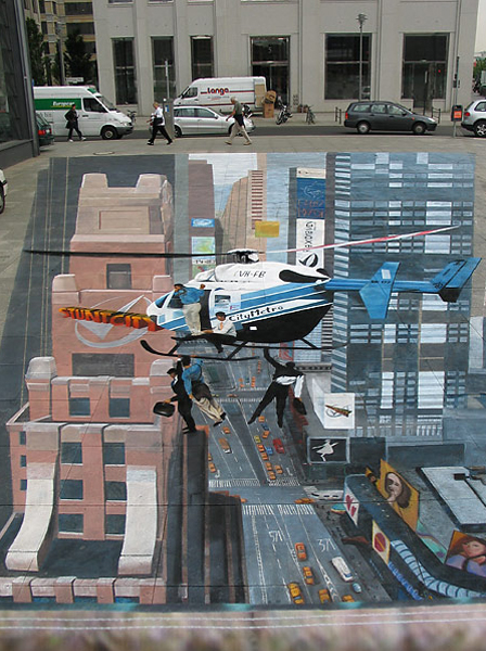 This is an interesting take on chalk graffiti and public art. More classified as 2-D art, but man, it sure looks 3-D. Take a look here.
-Kristen Petsche

Tuesday, March 1, 2011
Sister Corita Rules
Sister Corita Kent was a nun, artist and activist in the 60's & 70's. She eventually left the church, but remains welcome by both Catholics and atheists alike for her groundbreaking art education.
http://www.corita.org/

Note this:
http://www.corita.org/
Note this:
--SENSE DIARIES:
Corita urged her students to keep a record of everything that sparked their interest - words, poems, quotations, lyrics, signs, slogans, music, composers, films, books, images drawn or collected from magazines, photographs, descriptions of things or experiences, tastes and smells, encyclopedia entries, and newspaper headlines.
She had her students keep everything in their Sense Diaries, a special notebooks they made, for future reference.
Sound familiar?
Sister Corita's rules - hope you find these interesting
Rule I
FIND A PLACE YOU TRUST AND THEN TRY TRUSTING IT FOR A WHILE.
Rule 2
GENERAL DUTIES OF A STUDENT:
PULL EVERYTHING OUT OF YOUR TEACHER.
PULL EVERYTHING OUT OF YOUR FELLOW STUDENTS.
Rule 3
GENERAL DUTIES OF A TEACHER:
PULL EVERYTHING OUT OF YOUR STUDENTS.
Rule 4
CONSIDER EVERYTHING AN EXPERIMENT.
Rule 5
BE SELF DISCIPLINED. THIS MEANS
FINDING SOMEONE WISE OR SMART AND
CHOOSING TO FOLLOW THEM.
TO BE DISCIPLINED IS TO FOLLOW IN A GOOD WAY.
TO BE SELF DISCIPLINED IS TO FOLLOW IN A BETTER WAY.
Rule 6
NOTHING IS A MISTAKE. THERE’S NO WIN AND
NO FAIL. THERE’S ONLY MAKE.
Rule 7
The only rule is work.
IF YOU WORK IT WILL LEAD TO SOMETHING.
IT’S THE PEOPLE WHO DO ALL OF THE WORK ALL THE TIME
WHO EVENTUALLY CATCH ON TO THINGS.
Rule 8
DON’T TRY TO CREATE AND ANALYZE AT THE
SAME TIME. THEY’RE DIFFERENT PROCESSES.
Rule 9
BE HAPPY WHENEVER YOU CAN MANAGE IT.
ENJOY YOURSELF. IT’S LIGHTER THAN YOU
THINK.
Rule 10
"WE’RE BREAKING ALL OF THE RULES. EVEN
OUR OWN RULES. AND HOW DO WE DO THAT
BY LEAVING PLENTY OF ROOM FOR X QUANTITIES." JOHN CAGE
HELPFUL HINTS: ALWAYS BE AROUND. COME OR GO TO EVERY- THING. ALWAYS GO TO CLASSES. READ ANYTHING YOU CAN GET YOUR HANDS ON. LOOK AT MOVIES CAREFULLY, OFTEN. SAVE EVERYTHING IT MIGHT COME IN HANDY LATER. THERE SHOULD BE NEW RULES NEXT WEEK.
Monday, February 28, 2011

Artist Bio Sponsorship Location
steel On view through 2005 Battery Park City
|
| |||
| Keith Haring conceived Acrobats one year after the first exhibition of his free-standing steel pieces at Leo Castelli Gallery in 1985. Depicting two figures balanced in a remarkable gravity-defying pose, Acrobats is a work of incredible simplicity and vitality. Haring, a quintessentially urban artist, always sought to engage the public directly, from his earliest chalk drawings in New York subway stations to his final mural in a maternity hospital in Monte Carlo. In its temporary home in Battery Park City, Acrobats continues Haring's enduring vision of inserting art into the environs of our everyday lives. Artist Bio Sponsorship Location
I absolutely love this artist. He has some several public art pieces, performance pieces , paintings and sculpture. Teresa Neal | ||||


Sunday, February 27, 2011
Underwater Art

I saw this and really liked it. The artist is Jason de Caires. In May 2006 he gained international recognition for creating the world’s first underwater sculptural park in Grenada, West Indies. His underwater sculptures are designed to create artificial reefs for marine life to colonize and inhabit.
His website stated that only about 10-15 percent of the sea bed has a solid enough substratum to allow reefs to form naturally. In order to increase the number of reefs in these areas, the artificial reefs have recently been created from materials that are durable, secure and environmentally sensitive. These reefs have been successful in that they have attracted coral growth which in turn support an entire marine ecosystem.
Here is his website if you want to check it out. He has made over 400 life size sculptures that have been placed underwater. I really like the fact that his art is serving a purpose.
http://www.underwatersculpture.com/
-Heather herberg
Subscribe to:
Posts (Atom)