Monday, January 10, 2011

Couch Park at NW Hoyt & 19th


So I like a bunch of the other students ran into the problem of my work schedule blocking out any chance of me being able to attend the first Thursday, and well any other gallery event in our time line. So I decided that I would choose this piece that is displayed in Couch Park at NW Hoyt and 19th, and sorry for the poor photo, my cell phone had to work since my camera died.

I was not able to find the name or any information regarding who built the piece or when. It is an abstract piece that is composed of metal “tubes” (I’m assuming) that are cut and welded together in a form that almost looks like a mushroom skeleton, if they had skeletons that is. The negative and positive spaces are very interesting as you move about the piece since it is not symmetrical, the arching inner pieces are what the eye follows to the focal point in the center of the piece leading to the base. The form is very interesting that measures about six feet wide, it is composed of geometric lines that are entirely straight until you get to a joint that is still straight, but implies that the corners are rounded. I enjoy how simplistic this piece is with the simple lines and the colors of the metals.

Amy Grider

Power Play (Posted for Jordan Lane)

When visiting first Thursday in downtown Portland I had the desire to find some sculpture or other 3-d form of art that would be fairly eerie and evoke emotion. To my surprise I ended up choosing to write about a bronze killer whale, which is not eerie and did not evoke an emotion I could understand. For some reason I could not take my eyes off of it. Power Play, by Scott Hanson is a casted bronze sculpture of a killer whale. The whale supports its body by elegantly balancing on its tail, as if frozen in the middle of a well orchestrated dance. The whale’s fin seems to be bringing up the ocean current as its partner in the movement. It’s amazing to me how the sculpture from afar looks so metallic and golden, yet up close it looks almost as if the artist used the true colors of the killer whale. The sculpture has this mystifying balance between the sculpture itself and the negative space created around the whale’s dorsal fin, almost how a crescent moon looks balanced in the sky although there is a giant gap between each end of the moons visible surface. The artwork is very realistic in the way of the whale’s looks and form, yet is very abstract and humanized in the way it is dancing. It almost looks like a human ballet dancer in whale form. This piece reminds me of the connectivity and the faded line between animals, humans, and the earth. 
                                                                                                                               Jordan Lane

Portland Sidewalk Art


I have class until nine on Thursday so by the time I was free all the galleries were closing. It was disappointing because I am inspired to see as much as I can where ever I go. I was excited about seeing something new and beautiful when I was walking down the street and noticed something I have looked at many times but never really saw as art. There are three stone sculptures on the corner of 6th and Columbia outside a restaurant called Nel Centro. The pair of sculptures resting in the grass just outside the establishment’s outdoor seating area was the main focus of my attention. The sculptures are about 4 feet high and appear to be made of stone. Particularly what caught my eye was the composition. The proximity and simplicity of the freestanding pieces provide harmony, however, the direction gives contrast as one has a downward contour and the other has an upward contour that creates flowing rhythm. The negative space between the two pieces implies wave-like movement. One of the sculptures is higher than the other, creating variety and asymmetrical balance within the composition. Although there doesn’t seem to be a focal point, the squares cut into the stone blocks creates more variety and negative space within the stone mass. The tactile texture is smooth, cool and shiny while there is a presence of porous stone within the simulated texture. The motif always made me think of a couple of macaroni noodles and I assumed it was a sort of corporate art to make you hungry for pasta and Italian food, but now I see it in sculpture terms. I have tried to find more information about these sculptures but so far I have had no luck.

Michelle Caldwell

Ethan Jackson


During my travels through the galleries at First Thursday I discovered the work of Ethan Jackson inside Chambers@916. Jackson’s work title ‘Strait’, was an interactive video sculpture using digital projection onto a tabletop pedestal and mirrors. I later learned that Jackson is known for his anamorphic video work and optical installations (http://www.ethanjackson.net/).

The image projected onto the table-like surface displayed two abstracted rings of swirling colors opposite of one another. One ring consisted of blues and white flowing steadily in a counter-clockwise direction, the other a sea green and white spinning clockwise flowing at a much faster rate. When focusing on the projected image the swirling bodies look abstracted and flat, two-dimensional. Mounted on apposing sides are two cylindrical mirrors, each centered as the axis for each swirling ring. When the viewer focuses on the mirrors the image from the table surface is reflected onto it, revealing a new perspective of the image. The cylindrical mirrors transform the two-dimensional image into a three-dimensional image. The swirling colors of blue and white become clouds moving in the sky. The swirling colors of green and white become a whirlpool of water. The image that at first appeared as an abstraction becomes recognizable, changing the relationship of the images the viewer initially had.

I enjoyed Jackson’s work ‘Strait’ for it’s playfulness and it’s ability to create two entirely different perspectives of the same image. The movement of swirling colors was hypnotizing and aesthetically pleasing in-of-itself, and then he surprises you with a new way of looking at it. If you are curious to know more about anamorphic art I attached a wiki site that explains it quite well http://en.wikipedia.org/wiki/Anamorphosis.

Sunday, January 9, 2011

Jonathan Qualben


Jonathan Qualben’s pieces, Marquette #4 and Marquette #5, can currently be seen at Gallery 903. These elongated sculptures measure nearly 4 feet in height, but only inches in width and depth. They are worked from pigmented concrete.


The material is imperfectly smoothed over a majority of a piece, with disruptions ranging from small depressions to tectonic plane shifts. Areas such as these appear craggy, which gives the impression of rock or mountainous features. Brown and rusty tones help to reinforce an earthy appearance. The concrete that makes up these pieces is earth material, ash and rock. Similar to something that might be made by Andy Goldsworthy if he were to use manufactured materials with intentions for a home of the wealthier elite.


Both works appear to be abstracted figures. Marquette #5 looks christ-like with body stretched and arms positioned in a cross. In fact, according to the dictionary, Marquette was the name of a Jesuit missionary and early explorer of the americas. Despite what may be religious in inspiration, the pieces are relatively unassuming. As with other works by Qualben, visible on his personal website, he works with the human form without what appears to be much focus on meaning. Viewable within his Sculpture section, he states, “I love that the mark of a sweeping transitory hand, executed in a moment, like a watercolorist’s brushstroke, could be fixed in so permanent a record.” The artist’s focus seems largely on the intricacies of the material itself, not on any statement that it could make.


I have mixed feelings about this work. I am drawn to it for what it does well in appearance. Specifically, the subtle changes and personality of the concrete as a result of its forming. Its natural look is juxtaposed by its semi-natural material. But, the style is “safe” in the sense that it challenges no boundaries, questions nothing and offends no one. Of Gallery 903’s works on display, Marquette #4 and #5 take the greatest step away from this safety zone. And it is not a very long step.


Jeremy Wenrich

Transference: Andy Paiko & Ethan Rose


I was lucky enough to be able to see "Transference" by Andy Paiko, a renown glass artist who lives in Portland, and Ethan Rose, a sound artist who also lives in Portland, at The Museum of Contemporary Craft.
Walking into the main lobby you are instantly gravitated to the wall of slowly spinning glass bowls. Each one is wired with a hand made glass arm with a moist piece of cloth on it that is randomly pressed against the bowl, making a sound. With about 20 of these bowls spinning and making sounds, the room is filled an eerie hum. Each bowl is a different size and hand made, so the sounds they make are all different pitches.
The constant spinning of the bowls and their little imperfections makes for an interesting change of negative and positive space. The bowls are similar enough though, that there is a lot of continuity between them all, giving this kinetic exhibit a sense of unity.

Compliment II


Complement II

"A play on similarities and differences and how they benefit each other"-- Merrlee Moore Artist

Lake Oswego, Oregon, has an Art's Council, that is dedicated to beautifying their community. Every year they place a sculpture around different parts of the town. Sometimes they replace sculptures, or simply add new ones. The piece that I chose is a freestanding abstract piece by Merrlee Moore. It was a People's Choice winner in 2008.
This sculpture is two pieces, a fabricated grid with blown glass balls inside it, and a free form stainless steel piece. The shapes of both pieces are very curvy and flow,complimenting each other in not only shape, but color as well. The bright glass balls are different colors and have different patterns on them as well. The stainless steel piece, when looked closely at has a swirly texture. The coldness of the steel and the bright warm colors of the glass balls create a wonderful balence.

There is plenty of great positive and negative spaces as well. When looked at from different angles, different shapes and forms are visible that are not seen on just one plane. The rhythm of both these parts, create one very cohesive abstraction. This is a very large piece. Each part is close to six feet tall, and the whole piece together is approximately five and a half feet wide. Every time I drive by this piece, it is always shiny and bright, even on the cloudiest rainy day.
I think the grid part of this piece with the glass balls inside it reminds me of a ball pit that little kids play in. Even the connotations of a ball pit brings happy connotations I really enjoy looking at this piece.

Anillos


For this First Thursday assignment I went to my hometown of Lake Oswego, Oregon and walked around our downtown district. Lake Oswego Downtown is filled with artist’s sculptures on every sidewalk. One particular sculpture amongst all the chaos of shoppers and people passing by always catches my eye, a high-fired ceramic clay sculpture by Maria Wickwire called Anillos. A quote on the sculpture's plaque states that the artist's intentions for the piece was that it “evokes annual rings which show the history of a tree, just as life experiences are written in the cells of our bodies.” I think it is very clever how the artist uses this link between the human body and tree rings to tell history of a human life. The simplicity of the monochromatic color scheme helps to emphasize the lines formed by carved away rings around the mass of the focus's body. There is a sense of repetition coming from the lines as each line circles around the body of the sculpture. The lines of the sculpture are what draws the viewer's attention, as though it tells a story, the story of her life, just like rings on a tree can tell you a lot about what the tree had gone through. Emotion is evident through the body’s posture, though you can see the facial expression the way the body is posed gives even more emotion of life's struggles and wonder of what is yet to come.


- Sarah Seitz


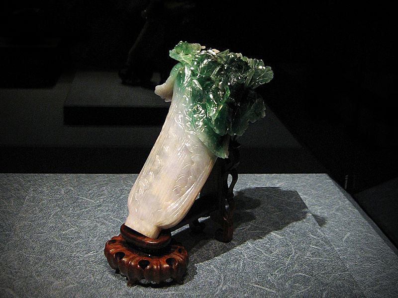
The Jadeite Cabbage


I had the pleasure of seeing The Jadeite Cabbage in Taiwan recently. It is not an abstract piece of art but a figurative one. It is one of the most famous art pieces at the National Palace Museum in Taipei, Taiwan. It is a tiny replication of a head of cabbage that measures about 7.5 inches long carved out of Jadeite stone. There is also a locust and katydid hidden among the leaves. Along with the texture of the stone and the organic carving of the leaves, the Jadeite Cabbage is a figurative sculpture of a scaled down head of cabbage that is exceptionally realistic. The values of green jade perfectly match that of a light translucent stalk of cabbage along with the vibrant leafy green hue that top the sculpture. The contrast in colors is strikingly similar to an actual bokchoy. The carving of the leaves is so delicate and organic it looks as if it is unfolding before the views eyes. Interestingly, the sculpture has been reproduced over and over as souvenirs and keepsakes. My favorite is shown along with the real sculpture. It is a tiny Jadeite Cabbage in edible dessert form that we got to eat at high tea at the museum after visiting the exhibition.

-Vivian Hsu


NW Irving and Third


Katie Clemens
MW Art 117
Jan 9, 2011
Due to my crazy schedule of school and work I didn't get the chance to experience the work displayed on First Thursday and by the time I had free time to venture downtown all of the galleries were closed. Therefore 3-D composition that I viewed and will respond to was found on the corner of NW Irving and Third. This sculpture is made up of oversized metal pieces contoured to look like the basic outlining of an eye, an eyelid, and eyelashes. Through the pupil of the eye a steering wheel and circular seat with cutout roman numerals could be seen. These elements are referring to a particular part of the human form, repeating them as they exist defining itself as figurative. This sculpture could also be defined as freestanding because it is placed upon a street corner, supported by itself and reliant upon its form and construction. The negative space depicts key parts of the sculptures form, such as the pupil of the eye and the empty space from the suggested lens to the corner of the eyelid. This lacks balance but if there is any implied it would most likely be radial balance. This would be a result of the fact that the sculpture is heavily dependent on the circular center as a mail focal point. In way of for and content this sculpture is completely without either attribute. This sculpture feels as though it was simply made per request of a paid job and not intended to have any deeper meaning or purpose. The only way that this has any meaning is due to the mass space of the objects creating hollows and voids within itself. The scale is less than that of a monumental work but larger than that of an exaggerated work making it nothing other than simply big. In way of unity and harmony the only thing taking place within this work is continuity and simplicity. Continuity can be seen in the large curve of the lid in which the curves of the lashes protruding from. Simplicity is depicted in the few lines and pieces making the sculpture overall. The largest focal point of the sculpture is the circular pupil from which the roman numerals and steering wheel can be seen through the negative space. Although this piece lacks many positive qualities I feel as though it is fairly strong in direction. The placement of the lashes from the pupil naturally leads your eyes to read the piece from right to left. It also seems as though there are many simplistic attributes and implied lines in helping create this natural reading of the sculpture. Overall in the review of this sculpture it is minimalistic, emotionless, and more of a piece of metal taking up sidewalk than what I would consider “art”. 

"Storyteller" by Linda Prokop, 2008


"Storyteller" by Linda Prokop, Bronze sculpture, 2008.

In addition to an copious amounts of rain, Oregon sports an abundance and a support for the arts that rivals the most famous US cities. Tualatin, Oregon is no exception to this appreciation. A popular path called the “Art Walk” winds around the city, through the parks, and makes a particular stop at the Tualatin Public Library which displays the freestanding “Storyteller” by Linda Prokop on a round pedestal in its brick entrance.

“Storyteller” is sadly an unremarkable piece for Prokop. The presentation of a gesticulating woman sitting above four eagerly listening children is an uninteresting approach to the topic. While this idea of circular formation storytelling is archetypal and more than likely something we all have experienced, Linda Prokop's skills reach far beyond common approaches such as this.

Prokop's method of bronze sculpture and casting is clear as one approaches “Storyteller”. Each of the five figures' surfaces shows the scrapes, pinches, and manipulations of clay that Prokop's additive sculpting method required. Given it is Prokop's style to have minimal rendering of facial features, the children's faces are all nearly identical and show the same amount of soulless interest. Prokop also acts counter-intuitively to classic focal point placement and sizing with “Storyteller”. In many of her other works she plays quite a bit with scale, but if the Storyteller were to stand up from her stump, she would be roughly the same height as her audience with almost identical features. The largest difference between her and her audience is that her arms are outspread whereas the children sit on the ground in their own tight positions. The lack of variation in height and arguably with expression makes this piece unfortunately more boring than thought-provoking.

“Storyteller”, while rather bland, does not represent of Prokop's portfolio to an adequate degree. The execution of how “Storyteller” speaks very well of Prokop's abilities and methods. While this piece would not be new to a gallery or museum setting, for its purpose, a decoration outside of a public library, it fits its place very well. As a good portion of modern America experiences bewilderment when faced with a sculpting artist like Calder or Brancusi, going for this type of art is a safe move for the Tualatin Public Library.


Links to Linda Prokop's art:
Bronze Coast Gallery

Meyer Gallery

The Dreamer


At the East end of Pettygrove Park in downtown Portland is a bronze sculpture named “The Dreamer” by Manuel Izquierdo. Three massive irregular bronze shapes rest upon the top of a two-tiered rectangular stone that resides in the middle of a drained fountain. The lack of water disrupts the composition making the sculptor appear very heavy, losing the feeling of elegance and weightlessness that the surrounding pool of water provides. The bronze pieces are asymmetrically balanced and could be interpreted as a possible human figure, or maybe Piglet from Winnie-the-Pooh. The rectangular stone is bland in color and adds an unnecessary pedestal to an unfamiliar idol. The only enjoyment I found from looking at this artwork was the warm yellow glow that emulates from the curvy metal shapes. I suppose the sound of a ringing splat caused by the connection of flying pigeon poop and bronze would spark an ounce of enjoyment, however even this effect would be lost because the artist filled the interior with foam to lessen the impact of falling rain.


- Halrey


Useful Art #5:The Western Hotel


On a trip through the Portland Art Museum I came across an eerie sculpture that I couldn’t help but stay back from my group and continue to admire it. The piece was Useful Art #5: The Western Hotel, by Edward Kienholz and Nancy Reddin Kienholz. The sculpture was a construction of multimedia that looked as if it had been taken straight out of the back country of Arizona or New Mexico. The piece was a moment in history, entirely preserved by resin that could have been seen as time itself, coating the two pipes and lighter resting beneath the lamp that sat atop the bedside table next to a homely looking cushioned wooden chair. The chair rested on top of an old style Mexican looking comfort rug with a pair of slippers and a half finished bottle of jack daniels to keep it company. The table top was also home to a mantelpiece clock connected to a small metal statue of a horse and a used yellow bowl with a spoon resting inside. Beneath it, the table top sheltered two western magazines and an old school radio that I would expect to find in my grandmother’s attic. From the radio, sad country songs were played at a low level giving the piece a melancholy feel that makes you wonder what a depressing life the inhabitant of the chair must lead. Just behind the table is a small wall with a window with credit card stickers and a red glowing neon vacancy sign in the upper half of the window which gives the illusion that the chairs’ inhabitant must spend hours at a time waiting for a customer to the hotel if not just a soul to talk to. Despite the lamp on the table and the neon vacancy sign, this sculpture was far from dynamic, with an eerie sense of stillness. The entire piece was placed on a red brick armature.

- Enrico Macias-Zepeda

Dave Herman, 'Embracing'


I try to avoid venturing into the Pearl at all costs, so i was pleasantly surprised when driving by SW 1st, there were two neighboring galleries with lights on and open doors. The first looked like a kiosk turned into gallery filled with airport art, the kind you might run by in Salt Lake City while late to catch a plane. Needless to say, as fun as it would be to dissect an art piece i couldn’t stand, I just couldn’t bring myself to go inside. The next gallery was a block away which looked only slightly more promising. Not wanting to make to make a night of it, the Attic Gallery seemed it would have to do. While the airport kiosk theme was still present, it was overwhelmed by the feeling that several high school art finals had gathered for my viewing. Hidden between large ceramic mushrooms and painted dogs and cats, there were two small freestanding bronze sculptures placed on a low bench like display in an adjacent room. These seemed to have been easily overlooked with the surrounding chaos, and maybe that is why this piece spoke to me, both it and I felt completely out of place.

Between the two figurative bronze works, I was drawn to the one titled “Embracing” due to the obvious tension of the piece which I knew would give me at least one vocabulary term to utilize. The muscles, posture, and tension give the feeling that this is not just a photograph of a moment in time; it seems to be happening before you eyes- the strain, the stretch, and two people reaching out and clinging to one another. There seems to be certain allegorical theme to this piece as well. While the faces are not visible, emotion is expressed through the bodies, form, and posture. Even with the angle in which the two heads are hung, and their sitting positions show this is not a simple happy, or casual embrace, there is a much more deep and maybe almost painful emotion taking place between the figures. The low placement of the bench, or display, upon which they are placed created a nice aerial view of the symmetry and balance of the piece. I’m not familiar with the bronze work or the process in which they are made, but by the artist leaving dark mass of negative space in between the two, instead of carving them completely free, still contrasts the two forms from their surroundings, but it also creates more of a feeling of a bond between them. It is not simply an emotional embrace or hug joining two figures, there is more between them, they are one.

I’m not sure if it was due to the context in which I discovered this piece, or if I would have still picked it out in a more copasetic environment, but whatever the reason, something within the work spoke to me. I’m glad I was able to give it a moment of deserved appreciation in the midst of over-sized and overdramtic cat/dog/mushroom stolen spotlight.


-Veva Campeau

Saturday, January 8, 2011

STEPHAN SOIHL

"Two Motorized Colored Forms", Stephan Soihl, 2010


Making my favorite first Thursday stop at Blackfish Gallery, my attention was immediately grabbed by Stephan Soihl’s unusually soothing sculpture. Titled “Two Motorized Colored Forms”, his two-part kinetic piece was composed of plexi-glass, colored motor oil, brass motors, and timers. Set against a white background the color and volume of the plexi-glass forms is accentuated. Each abstract form, one filled with yellow motor oil, the other green, rotated slowly in alternating directions. The green form was set on a single line, with a thin tube of plexi-glass and one and a triangular prism at the other. The yellow form was constructed with a radial balance consisting of three protruding prisms of different size and shape. Without movement, the asymmetrical balance of the piece would not have been as well emphasized. Not only was the kinetics of the overall piece interesting, but the liquid motor oil inside each prism traveled throughout the sculpture creating dynamic volumes and an equally interesting visual.

-Kristen Petsche


“Pellucid”

Rebecca DiDomenico, “Pellucid”, 2010.


Recently, I got the chance to visit the Museum of Contemporary Art in Denver, Colorado. One of the most intriguing pieces in the current exhibition happened to be an installation executed by a local artist- Rebecca DiDomenico. Pellucid is the title of the cave that DiDomenico created to be exhibited specifically in the MCA.

Upon entering the exhibition space, the exterior of the cave appears to be composed from white, biomorphic rock. With a closer look the visitor sees a side entrance. The interior of the cave is transformed into a heavily saturated array of color and light, juxtaposing its bland exterior. Thousands of mica scales are arranged on the walls, containing the motif of inserted butterfly wings among other found objects. Amidst the colorful scales, DiDomenico inserts icicles composed from iridescent stone coming from the ten foot tall ceiling, mirroring the blue of the “water” on the sides of the floor. The viewer is led through the installation by the alternating the hues of the scales, which continue for about thirty feet. The artist creates a careful arrangement and adds intricate detail to the simplest shapes within the cave. DiDomenico transforms a white-walled display space into a blissful haven.


Yevgenia Tsveleva

Human Sculpture Project

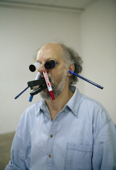
Today we explored the work of Erwin Wurm, using the human body as a malleable sculptural material,  interacting with our environments & each other. Water ballet and contemporary dance with also inspirations.


Student work:


Thursday, January 6, 2011

First Thursday Writing Assignment

Your writing assignment is to get you off the sofa and into art spaces where you can experience and learn to understand, appreciate and discuss 3D art, using an appropriate vocabulary to do so.
If you can't make it to First Thursday (though it is a good habit to get into), feel free to write about a public art piece, something in the Portland Art Museum, on PSU campus (there are many galleries on campus with great work) or any other 3D artwork you have very recently experienced in person. Please post your writing (one page max) and an image, if possible, on the blog by Monday Jan. 10th at 9am.
Thanks and enjoy!

Monday, January 3, 2011

First post. Here we go.

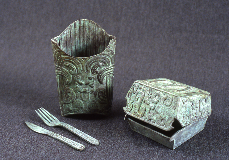
Zhang Hongtu, "Mai Dang Lao" cast bronzes, 2002. (Click for a larger size).

I figured a good contribution would be some bronze work by one of my favorite artists, Zhang Hongtu, a Chinese artist living out of New York. Due to his location, a lot of his work is a reflection of Chinese censorship, particularly evident with his "Material Mao" collection, but he largely experiments and plays with mixing Chinese and Western styling.

This piece, "Mai Dang Lao" is my personal favorite because its a perfect mix of Bronze age Chinese aesthetic as a couple of McDonald's containers. It's based off of Chinese bronzes made in the Shang Dynasty, 1600-1046 BCE. The design on the bronzes mimic the taotie face designs common during that time.

Zhang Hongtu works with a big variety of media so I really recommend checking him out. His paintings of Chinese literati scenery in the style of Van Gogh are also humorous and very beautiful. Hopefully it will be of some sort of inspiration for you guys or at the very least be of interest.

Thanks for looking,
-Emily C.

Zhang Hongtu's site: http://www.momao.com/
"Mai Dang Lao" can be found under the "Mixed Media" tab on his Gallery page.

Wikipedia's article on taotie designs: http://en.wikipedia.org/wiki/Taotie
Wikipedia's article on the Shang Dynasty: http://en.wikipedia.org/wiki/Shang_Dynasty

Testing the new blog

Hello students!